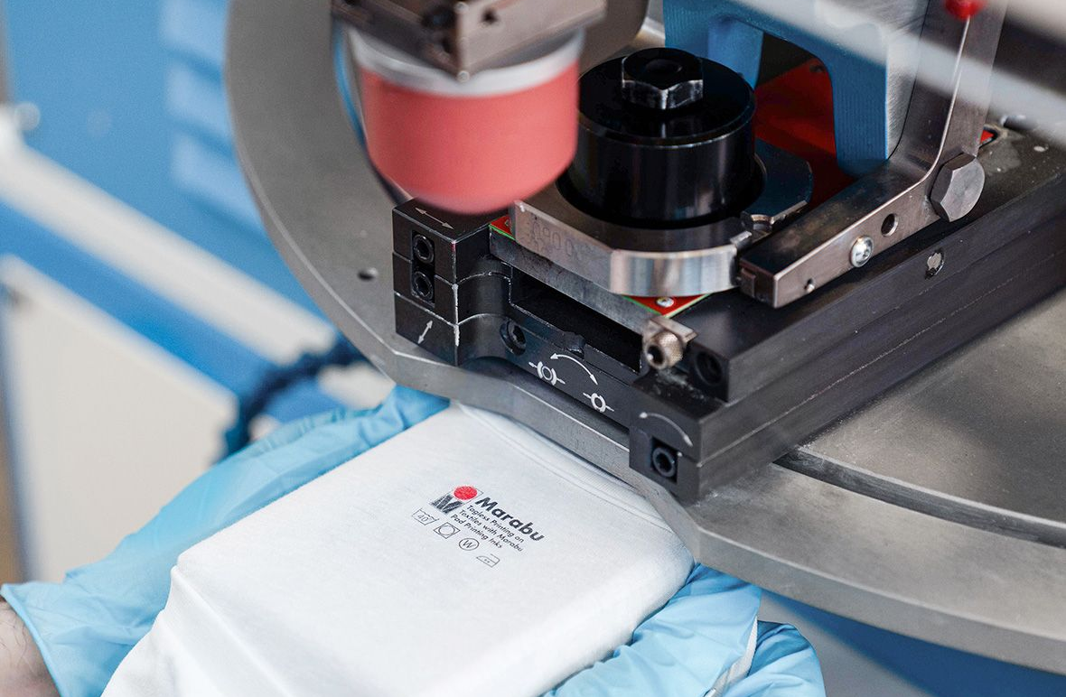
Precise color matching is a hallmark of printing excellence in the printing world. Whether you’re creating branded automotive parts via pad printing or elegant wall graphics to be displayed inside a restaurant’s interior, accurate color reproduction ensures that the outcome looks stunning and communicates the intended message. This blog will guide printing professionals through the process of achieving custom color matching, helping you deliver exceptional results for your clients.

Understanding Color Basics
Before diving into custom color matching, it’s crucial to grasp the fundamentals of colors and how they apply to the printing process. Here’s what to know:
Color Models
- Lab (Lightness, a Channel, b Channel): The Lab color model is designed to approximate human vision, ensuring consistency and accuracy in color representation across various devices and mediums. The ‘L’ axis represents lightness, while the ‘A’ and ‘B’ axes represent the color spectrum from green to red and blue to yellow. This model is crucial in industries like digital imaging and photography, where precise color manipulation is key to maintaining the desired visual output.
- RGB (Red, Green, Blue): RGB is the color model used in digital displays and cameras. It combines these three primary light colors to create a wide range of colors. Understanding RGB is essential when designing digital graphics.
Color Temperature
- Color temperature refers to the perceived warmth or coolness of a color. Understanding color temperature helps printing professionals select the right colors for specific printing projects. For example, warm colors (e.g., reds and yellows) can evoke feelings of positivity and energy, which can be ideal for creating a memorable dining experience in restaurants or a sense of adventurism in tourist hotels. As another example, cool colors (e.g., blues and greens) convey calmness and tranquility, which can be great for educational settings, bookstores, offices, and more.
Choosing the Right Color Management System

A Color Management System (CMS) is a software tool designed to ensure accurate and consistent color reproduction and color consistency across various devices and mediums. Selecting the appropriate CMS is essential for printing professionals aiming to achieve precise color matching.
The right CMS can streamline your workflow, maintain consistency across devices, and ensure that your prints reproduce the intended colors. There are several different options for a CMS program out there, and here’s what you can consider when choosing the one that is best for you:
- Compatibility with your equipment: Ensure the CMS is compatible with your hardware. Some CMS software may be tailored to specific printer models or monitor types. Verify that the CMS can communicate seamlessly with your devices.
- Industry standards: Look for CMS solutions that adhere to industry standards. These standards, such as ICC (International Color Consortium) profiles, ensure compatibility across various software and hardware. A CMS that supports ICC profiles can help maintain consistency in color management.
- Ease of use: Choosing a user-friendly CMS system will simplify the process of honing in on the precise colors you’re looking for. Check to see if the CMS offers intuitive interfaces instead of complicated ones.
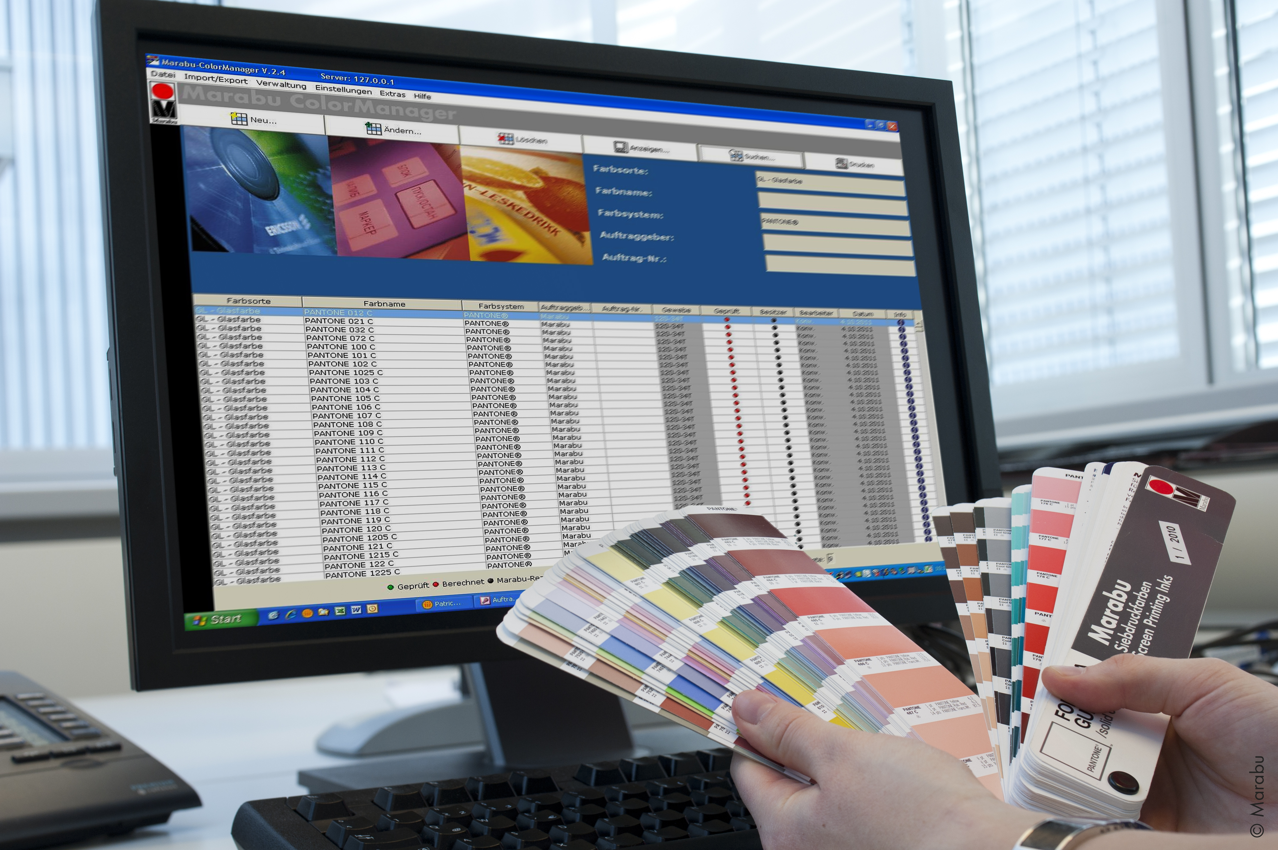
Check and recalibrate your monitor so that it displays color correctly. Color management software can be complicated and difficult to navigate, and for this reason, the team at Marabu has created a Marabu ColorManager — a user-friendly format that is ideal for any printing professional, no matter what stage they may be at in their career.
Create Custom Color Profiles

You can create a custom color profile once you’ve selected your CMS system and software. Defining the target color is a foundational step in custom color matching for printing professionals. It involves specifying the exact color you aim to reproduce in your prints. This could be a specific Pantone color, an RGB or Lab value, or a color from a client’s branding guidelines.
Whenever possible, provide visual references for the target color. These could be digital representations, but if possible, provide physical samples of the target color, such as printed materials, fabric swatches, or product samples.
Remember to collaborate closely with your client to define the target color early in the process — it can take several iterations before you’re able to achieve the exact color your client is looking for. Encourage your client to provide as much detail as possible about their color expectations, and ask for their feedback during the color-matching process.
It may take some trial and error to reproduce the exact color you intend to achieve, but once you are satisfied with the result, you can save that color profile within your software settings for future use.
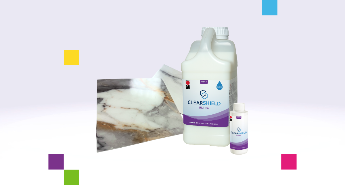
Consider Your Substrate
Be mindful that colors can interact in complex ways during printing, affecting the final output. For example, you might expect pure blue when combining cyan and magenta inks. However, this may result in a slightly different shade in practice due to ink properties and how the ink interacts and is absorbed into the given substrate.
In addition, different substrates absorb and reflect light differently, affecting how colors are perceived. For instance, colors printed on matte paper may appear more muted due to increased light absorption, while colors on glossy paper may appear more vibrant due to greater reflectance.
Last but not least, different substrates have varying color gamuts — from narrow to wide — and some substrates may not support specific vivid or saturated colors.
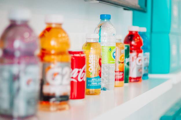
Here’s a scenario illustrating how substrates can affect the final printing outcome. Imagine that you’re printing for a well-known beverage company and tasked with printing logos and designs directly onto their glass bottles. However, this particular substrate (i.e., the glass bottle) has a limited color gamut, making it challenging to reproduce the vibrant colors of the product images. You’ll need to work within the substrate’s constraints to match the colors as closely as possible.
As you can see, professionals should strongly consider the substrate they print on, whether it’s glass, wood, metal, plastic, vinyl, or something else, for accurate color reproduction.
The Importance of Testing

The iterative process of testing and adjusting helps fine-tune your color profiles and ensures that your prints accurately reproduce the desired colors. Hence, we recommend you don’t skip the step of testing your first batch. Testing can save you hundreds to thousands of dollars in the long run, especially if you have over 100 orders for your client’s printing project. Here’s how you can make the most out of your test prints:
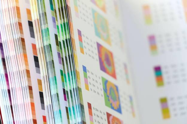
- Use reference materials: Include reference materials (such as color swatches and color samples), your client’s branded color style guides, and product samples. These references serve as benchmarks for comparing color accuracy and achieving the perfect color.
- Use the correct substrate: As mentioned earlier, the final outcome can differ dramatically once it’s directly printed onto a given substrate. For example, don’t use paper as your test print if your final outcome is meant to be printed on plastic.
- Consistent lighting: Evaluate the test prints under consistent and neutral lighting conditions to minimize color discrepancies and color distortions.
- Adjust as necessary: It may take several iterations for you to achieve the exact desired color effect. Adjust your saved color profile in your CMS software as needed.
Testing can be a long, time-intensive, and laborious process. At Marabu, we take the guesswork out of your printing jobs by offering testing services for your screen and pad projects. We create custom inks and test them directly onto the substrate you will be using for your printing job. Contact your printing partner today to learn how we can help you with your printing project.